|
|
Post by Flowgli on Jul 12, 2018 9:55:58 GMT -5
After just finding out in YBF91’s most recent video that another episode of The Logo Corner will be coming soon and he has an idea for another logo series, I’ve decided to start a thread where everyone can post logos that they make. Here are a few logos I created. 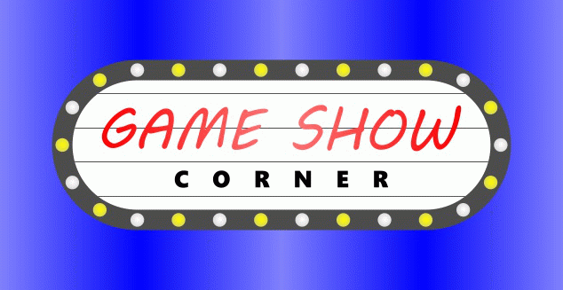 As everyone knows, this is the logo for my weekly forum series called Game Show Corner, which will be starting year five this fall. 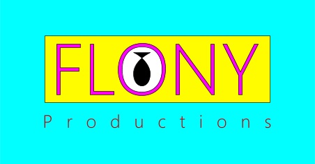 This logo is a prototype logo for a production company that Flo and Tony, my two main pups in this forum, called Flony Productions, and in that company, they will be producing game shows together, with Flo being more in charge of the company than Tony, of course. 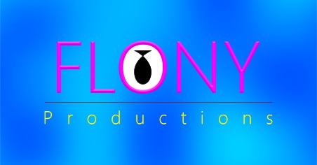 This is the official logo for Flony Productions. These are the logo pics I have for now, and I plan to make more. Meanwhile, other members here can post logo pics of their own in this thread. |
|
|
|
Post by Trey_Vore on Jul 12, 2018 12:00:41 GMT -5
Andy Warhol would be proud.
|
|
|
|
Post by Flowgli on May 11, 2019 14:31:29 GMT -5
Well, it would be exactly ten months ago tomorrow since I last posted anything in this thread. I now have a new logo to post here, and it’s a gif image. Here it is.  This is the logo for Belchic’s series called Commercial Corner. This logo features a television showing four different advertisements: one is about cereal, one is about board games, one is about candy, and one is about video games. I’ve seen him continue with his series recently, so I thought I’d make this for him to use on each edition of it that he releases. Now, keep in mind that anyone can post any logo art in this thread, not just me. So, if you have any logo art that you want to post, it’s okay to post it here. |
|
|
|
Post by Flowgli on Jun 18, 2019 22:36:51 GMT -5
I came up with another logo for another production company that I made up. Here’s the logo.  This is a logo for a company called Beautiful Storm Entertainment, a company founded by Thunderbolt, Lightning, Amber, and Tornado, and in that company, they will produce shows that star them. |
|
|
|
Post by Flowgli on Nov 9, 2019 10:07:57 GMT -5
Okay, I have just restored the logos for Commercial Corner and Beautiful Storm Entertainment after the shutdown of Tinypic. Now, I have a new logo to post here, and it’s for something I came up with some time ago.  This is the logo for a new series that I’m planning to do in the future. The series is called Game Show Graveyard, and it will be a spin-off of Game Show Corner. The logo for Game Show Graveyard is a contestant podium, complete with buzzer, that’s in the form of a tombstone, with the words on it lighting up and going off continuously. The background for the logo is supposed to resemble a night sky with gray clouds. In Game Show Graveyard, I will be covering game show pilots that never sold. Also, editions for this series will be released on a weekly basis on October every year, with the day of the week for the releases of the editions determined by which one Halloween falls in that year. So, because Halloween was just over a week ago, I will start the series on October next year. I will still be doing Game Show Corner, though. |
|
|
|
Post by Flowgli on Jul 6, 2020 22:47:23 GMT -5
Well, it’s been a while since anything new was posted here. So, here’s another logo coming up.  Okay, so, it’s not a logo for anything I came up with or a logo for anyone else to use for their things. This is actually a take on a logo for a company that ceased to exist twenty years ago. The company in question is Simitar Entertainment. The way I made it is supposed to resemble the ‘90s variant, though it’s flat and visibly outlined, like the DVD variant, and it has a lot of thin lines, like the ‘80s variant. |
|
|
|
Post by Nemo on Jul 8, 2020 14:47:15 GMT -5
I definitely get a 90s vibe from it, like something I'd see on a commercial on a VHS tape, well done!
|
|
|
|
Post by Flowgli on Jul 10, 2020 9:16:35 GMT -5
I got some more logos coming up, right now. These logos are actually my own changes to actual business logos that have been seen to have inappropriate content. Here are the changes I made to them.  This is my change to the logo for a Swedish company called Locum. In the actual logo, all the letters are lowercase, and the “o” has its place taken by a heart. That logo led people to see it as a phrase that reads “I love...” oh, you know the rest! So, what I did here was have all the letters there, including the “o”, and have them all capitalized, and I kept the heart, but I had the middle part cut out and had the company name fit in that empty space.  This is my change to the logo for a video store called Megaflicks. In the actual logo, the name is shown as one word, with a font and all the letters so close together that, if one looks at the logo from a specific perspective, the “l” and the “i” looks like a “u”, making the name look like a naughty word. So, what I did here was have the name shown as two words, with “Mega” on top of “Flicks”, with the former word being larger, and all the letters in the latter word spaced out enough to fit the length of the above word and prevent the problem made on the actual logo. I also used a different font for the text to prevent the problem even further.  This is my change to the logo for an Italian business called A-Style. In the actual logo, the “a” has two big dots next to it and positioned in a way that it looks as if two people doing a sexual act. So, what I did here was have no dots near the “a” and instead have one big dot used as a hyphen, and I have the word “style” as part of the logo instead of just smaller text below.  This is my change to the logo for a consignment store called Kids Exchange. In the actual logo, both words are on the same line, and the space between the two words is hardly noticeable that it looks as if it can be read as “Kid Sex Change”. So, what I did here was have the two words in two separate lines, with the second word on an arrow.  This is my change to the logo for a Taiwanese business called Bureau of Health Promotion. In the actual logo, what were supposed to be the initials were made to resemble people, but the way they were made there looks as if the people are doing a sexual act. So, what I did here was have the initials as actual letters not resembling people whatsoever and add a cross where the “h” and “p” are. So, those are my changes to some business logos. I got the idea to do this from pages that show someone having done the same thing to many other business logos. |
|
|
|
Post by Stirfry on Jul 10, 2020 16:25:56 GMT -5
Actually, apparently, the A Style logo was a deliberate choice by A Style. They wanted the logo to look sexual to get people's attention. The UK's Office of Government Commerce logo though... Yeah this was a mistake. =P  |
|
|
|
Post by Flowgli on Jul 10, 2020 16:39:07 GMT -5
I knew that the A-Style logo was deliberate. I don’t care if it was deliberate and not a mistake, though. It was still inappropriate-looking that I chose to make a change to it.
I also know about the OGC logo and how that was a mistake. I just chose not to bother to make my own change to that.
|
|
|
|
Post by Flowgli on Sept 30, 2020 22:05:47 GMT -5
I have another pic of a logo for a real company ready to be put up here. Are you ready for it? Well, if not, here it is anyway.  It’s my version of the Viacom logo. Like with my version of the Simitar Entertainment logo, I combined elements of multiple variants of the logo. I use the “V” shape and the wording under it in “Wigga-Wigga” form. |
|
|
|
Post by Flowgli on Oct 29, 2020 15:40:33 GMT -5
I’ve made three more logo pics, and here they are.  Here’s my take on the current Warner Bros. print logo.  Here’s my take on the classic New Line Cinema logo.  And here’s my take on the current Silver Pictures logo, even though the wording currently isn’t present in the logo in actuality. |
|
|
|
Post by Flowgli on Jan 9, 2021 16:03:32 GMT -5
So, I’ve decided to make pics of logos for television networks. Here’s one, now.  This is my take on the classic logo for a Spanish-language network called Univision. |
|
|
|
Post by Flowgli on Feb 17, 2022 22:06:55 GMT -5
Well, it’s been over a year since I’ve last posted any logo pics here, so it’s time that I post more here. It makes me wonder, though, why no one else has bothered to make pics like these for this thread, too. Well, anyway, here’s the next batch of logo pics I made.  This is my pic of the ABC logo.  And this is my pic of the CBS logo. The font I used for the letters here is as close as I could get to make it look like the network’s classic font.  This is the logo of a film company that I made up. It’s called One Of A Kind Pictures, and it was founded by Patch. This company makes movies that star Patch and sometimes others he personally knows. As you can see, there are fifteen circles in the logo, fourteen of which are white, and one of which is black. These circles represent the fifteen pups that Pongo and Perdita have in their litter, and the black circle represents Patch, while the fourteen white ones represent his blood siblings.  And this is the logo of the television division of the company called One Of A Kind Productions, which makes TV shows that star Patch and sometimes others he personally knows.  And now, it’s time for a version of a logo defunct real life film studio and home video company. This is my version of LIVE Entertainment, which had multiple different names during its existence. It was known before as U.S.A. Home Video, International Video Entertainment (or IVE), and later as Artisan Entertainment. Out of all the names and logos used during the company’s history, the LIVE Entertainment one was the one that interested me the most to make my own version of it, so that’s what I did here.  And now, a version of a logo of a Spanish animated television company called BRB Internacional. As you can see, I added a “50th Anniversary” notice, because this year is the 50th anniversary of the company. I also must add that this year is also the 30th anniversary of Sandokan, one of the shows from the company.  And here’s the standard variant of my version of the logo of the company. That sure is a lot of logo art to post here. Starting in my next post here, I won’t be posting too much logo art at once. |
|
|
|
Post by Flowgli on Sept 3, 2022 12:10:18 GMT -5
I have another logo pic ready to be posted here.  This is my take on one of the logos for a Canadian entertainment company called Entertainment One, or eOne, for short. |
|